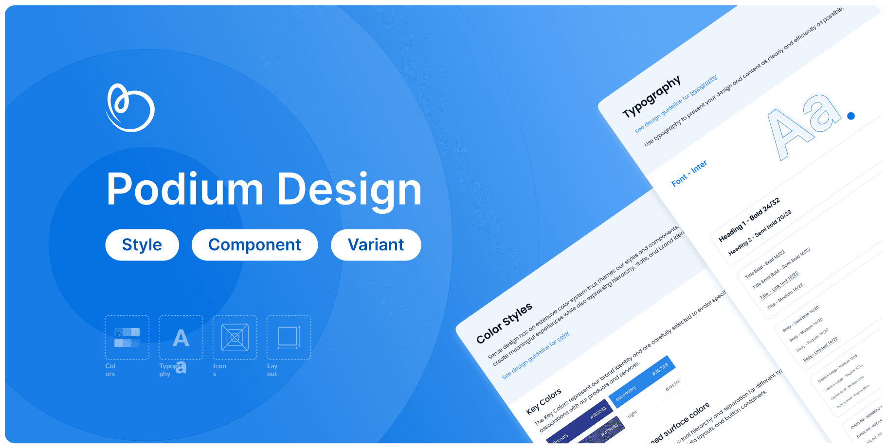
Podium design system
TEAM


MY ROLE
• Led the design system initiative to unify UX across BetterPlace’s products.
• Conducted design sprints to align product and business needs.
• Collaborated with CPTO, engineers, and designers to drive adoption.
• Enhanced scalability and efficiency through a structured design framework.
Created a design system that improves accessibility, efficiency, and usability for the blue-collar workforce - making screens clearer and more consistent.
TIMELINE FOR DESIGN
3 months
OUTCOME
Consistent Design
Combines three previously used design systems into one unified system
Scalable Framework
Supports future growth and adaptability.
B2B
Current chaos
Why we need design system
Fragmented Design Systems
The previous team intentionally created three different, incomplete design systems to differentiate products. However, as BetterPlace scaled into a SaaS platform, this approach became a roadblock.
Inconsistencies Across Products
With six products under one umbrella, multiple design systems coexist, causing confusion and inconsistency. Designers and developers struggle to choose the right system, leading to a chaotic mix of components within a single product.
The Need for a Unified System
A single, scalable design system will:
Eliminate confusion with clear guidelines.
Ensure consistency with standardized components.
Support growth with a structured, scalable approach.

Approach
Approach 1
Process Breakdown
To ensure a structured and efficient transition, we followed a step-by-step process to identify, analyze, and build a cohesive design system. The approach we followed was:
sTEP 1
sTEP 2
sTEP 3
sTEP 4
Old components
Phased execution
Checking other DS
New Component
Categorizing all existing components.
Dividing the process into three phases for better management.
Reviewing similar components from other publicly available design systems.
Using insights to build our own standardized components.
Our aPPROACH
STEP 1
Old components
Our approach
Identified components
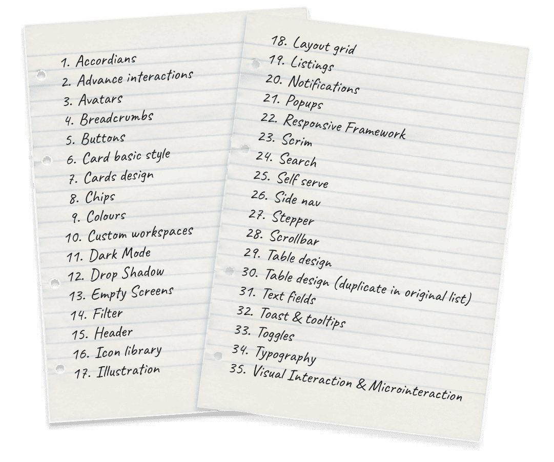
We went through all the products and listed all the components we used in them.
These are the list of component which we find:
Our approach
Finding the chaos
During this analysis of our product, we also checked the usage of components across multiple products and documented it. This helps the team understand the extent of the chaos. You can find the details in the linked Figma file.
STEP 2
Phased execution
Our approach
Priority Components
To make the work easier, we spoke with the PM and engineering team to mutually decide which components to focus on first for the biggest impact on the overall UI. Based on those inputs, we divided our process into three phases.
Phase 2
Popups
Cards design
Error Screens / (404) Screens
Illustration
Accordians
Listings
Visual Interaction
Card basic style
Notifications
Phase 3
Dark Mode
Accessibility
Advance interactions
Self serve
Analytics
Custom workspaces
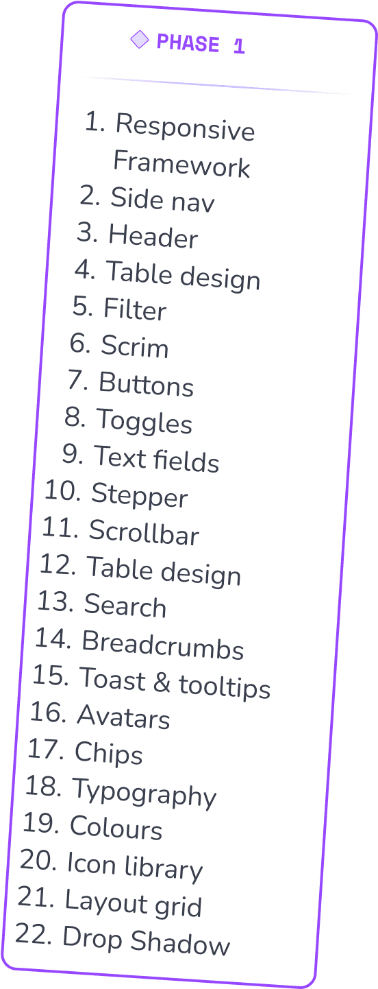
Phase 1 -
Components with big impacts
STEP 3
Checking other DS
Our approach
Analyzing well built DS
For Phase 1 components, we aimed to set standards by analyzing and learning from other design systems. We studied their structure, how they defined component values, and best practices. The design systems we analyzed include Microsoft Fluent, Carbon Design System, Decathlon DS, Ant Design, Skyscanner, Adobe Spectrum, Atlassian, and Material Design System.
You can find the research data in this linked Figma file.
STEP 4
New Components
Milestone 1
Fundamentals
M1.1
Colors
Podium design has an extensive color system that themes our styles and components. Use color to create meaningful experiences while also expressing hierarchy, state, and brand identity.
Primary Colors
900
#000E66
800
#032199
700
#063BCC
600
#0953E5
500
#0D6EFD
400
#3383FF
300
#66A2FF
200
#99C1FF
100
#CCE1FF
50
#
Grey
900
#292C33
800
#40464D
700
#585F66
600
#707580
500
#A1A7B2
400
#BCC1CC
300
#D8DCE5
200
#E9ECF2
100
#
50
#FCFDFF
Accent
900
#422899
700
#573FCC
500
#5649CC
300
#776FFF
200
#9F99FF
100
#CFCCFF
50
#ECEBFF
Red
900
#631718
700
#881A1B
500
#B82020
300
#DC3030
200
#E36363
100
#F4AAAA
50
#FCE8E8
Green
900
#155239
700
#187741
500
300
#38C172
200
#74D99F
100
#A8EEC1
50
#E3FCEC
Green
900
#5C4813
700
#8C6D1F
500
#CAA53D
300
#F4CA64
200
#FAE29F
100
#FDF3D7
50
#FFFCF4
M1.2
Corner radius
Using corner radius to define the curvature of elements, adding visual depth and to enhance the design aesthetics. The corner radius values can be applied to various UI elements to create diverse visual styles, add hierarchy, and evoke specific emotions.
Use cases:
Text Fields (8px): Use an 8px corner radius for text fields to offer a balanced and approachable look, making them blend seamlessly within content-driven interfaces.
Buttons:
8px Corner Radius: Use for primary and secondary action buttons
16px Corner Radius: Can be used for chips or status.
XS(4px)
Small(8px)
Medium(12 px)
Large(16 px)
Extra Large(20 px)
M1.3
Elevation
For elevation, we planned two types—surface-level elevation and overlay elevation—to create inset and offset effects.
Surface elevation

Overlay elevation

Light
Strong
Hover
Default (+Y)
Negative (-Y)
Light - Light elevation is used to subtly raise a container, offering a gentle distinction within the layout.
Strong - Strong elevation is used to draw focus to a specific container, making it stand out prominently to capture attention.
Hover - Hover elevation is primarily applied to actionable elements, creating an interactive effect upon hovering, engaging users effectively.
Default (+Y) - Use this to elevate content in the positive y direction to brings elements slightly above their original position. For ex: FAB, Dropdown Menus, Tooltips, Notification Banners
Negative (-Y) - Use this for lower content in the negative y direction to push elements slightly below their original position, enhancing the visual depth of the design.
M1.4
Grid & Spacing
Grids establishes a consistent layout foundation and precise spacing guidelines for crafting well-structured interfaces. This component includes the Grid System and Division Ratios for well structured responsive layout.
Basic Layout

1156 px, 12 coloumns
Center ( Workable area )
20 px
78 px
236 px
Side nav ( Fixed )
72 px
Header ( Fixed )
24 px
24 px
24 px
24 px
M1.5
Typography
Typography guidelines mainly focus on presenting the design and content as clearly and efficiently as possible.
Display
Headlines
Body
Caption
Overline
Title - Bold 32/38
Heading 1 - Bold 24/32
Heading 2 - Semi bold 20/28
Title Bold - Bold 16/22
Title Semi Bold - Semi Bold 16/22
Title - Link text 16/22
Title - Medium 16/22
Body - Semi Bold 14/20
Body - Medium 14/20
Body - Regular 14/20
Body - Link text 14/20
Caption Large - Regular 12/16
Caption Small - Medium 10/14
Caption Small - Regular 10/14
Overline- Semibold 12/16
Overline- MEDIUM 12/16
Overline- rEGULAR 12/16
INTER
Milestone 2
Phase 1 components
M1.1
Dividing & Refining Components
Once the fundamentals were established, the four of us split up, each taking different components to work on individually. We then regrouped at the end to gather feedback and approval. Below, I’ll show the list of components I worked on, and you can refer to the attached Figma file for the rest.
M2.1
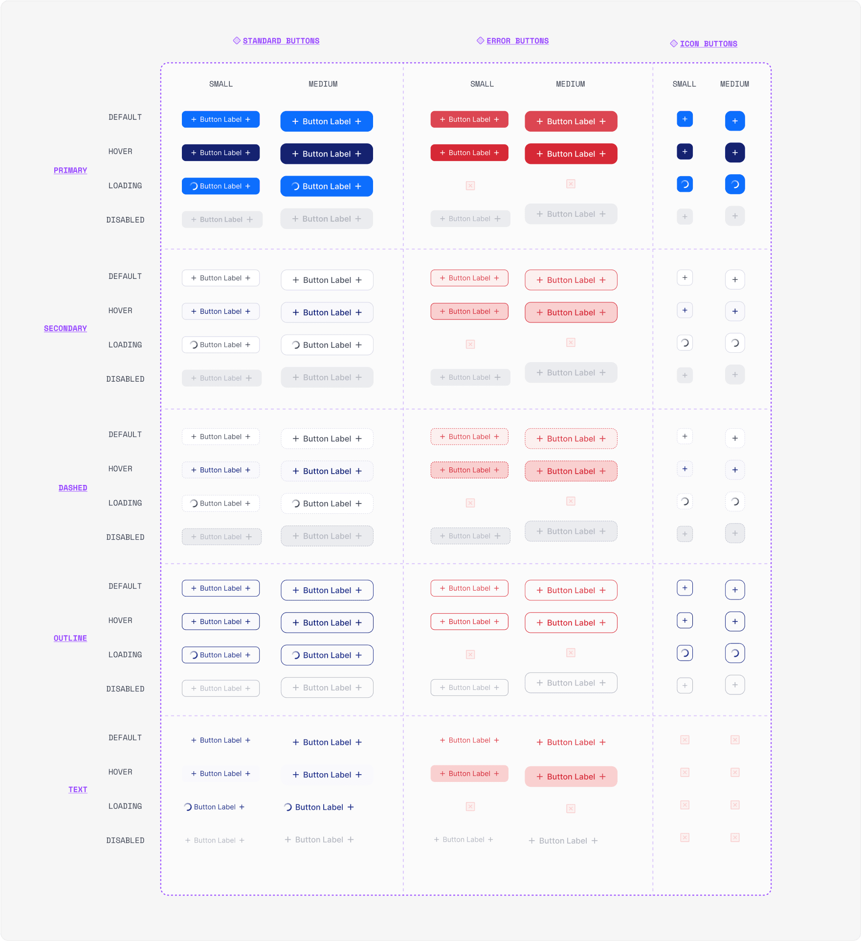
Buttons
We offer a variety of button styles to cater to different design needs. Each button type comes with multiple states, including hover, error, disabled, loading, and the default state. This comprehensive range ensures visually appealing and responsive buttons for diverse user interactions.
M2.2
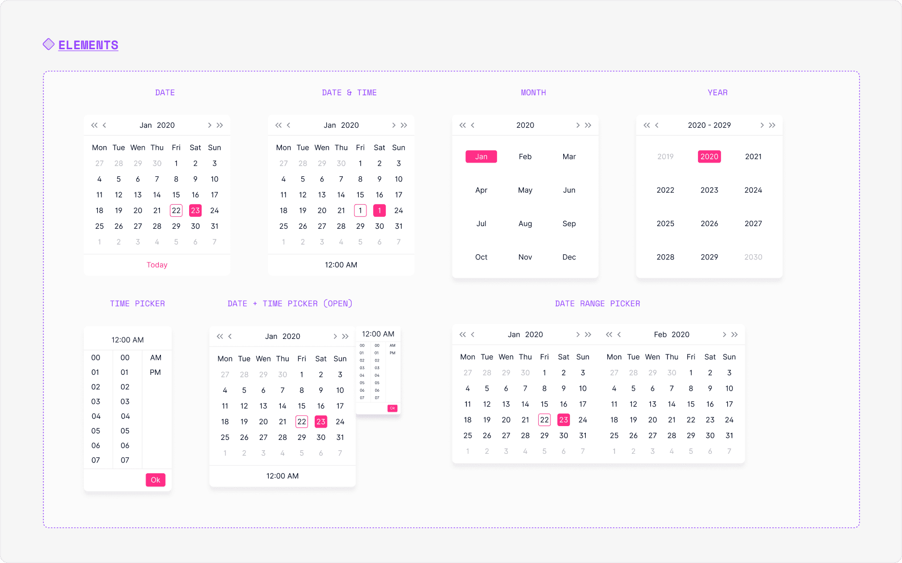
Date and time picker
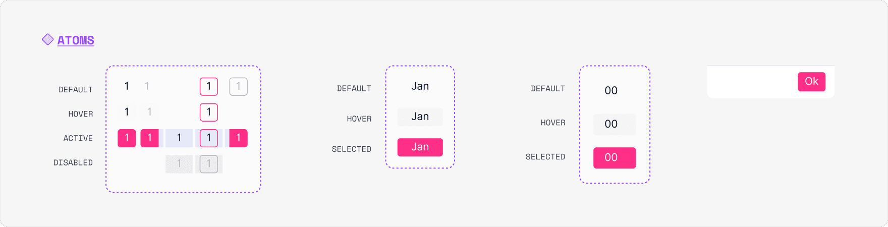
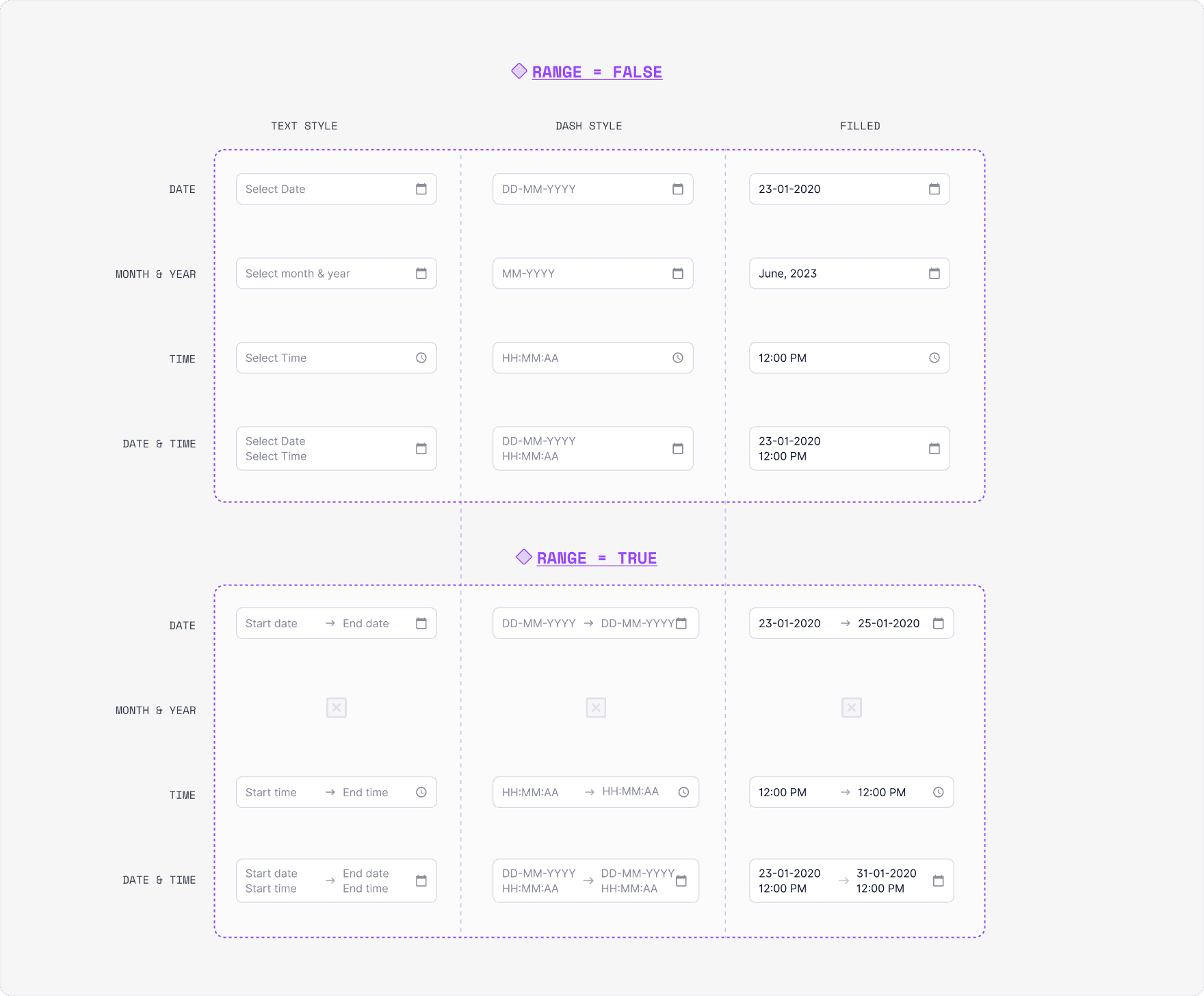
M2.3
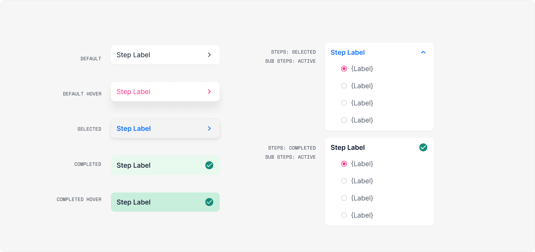
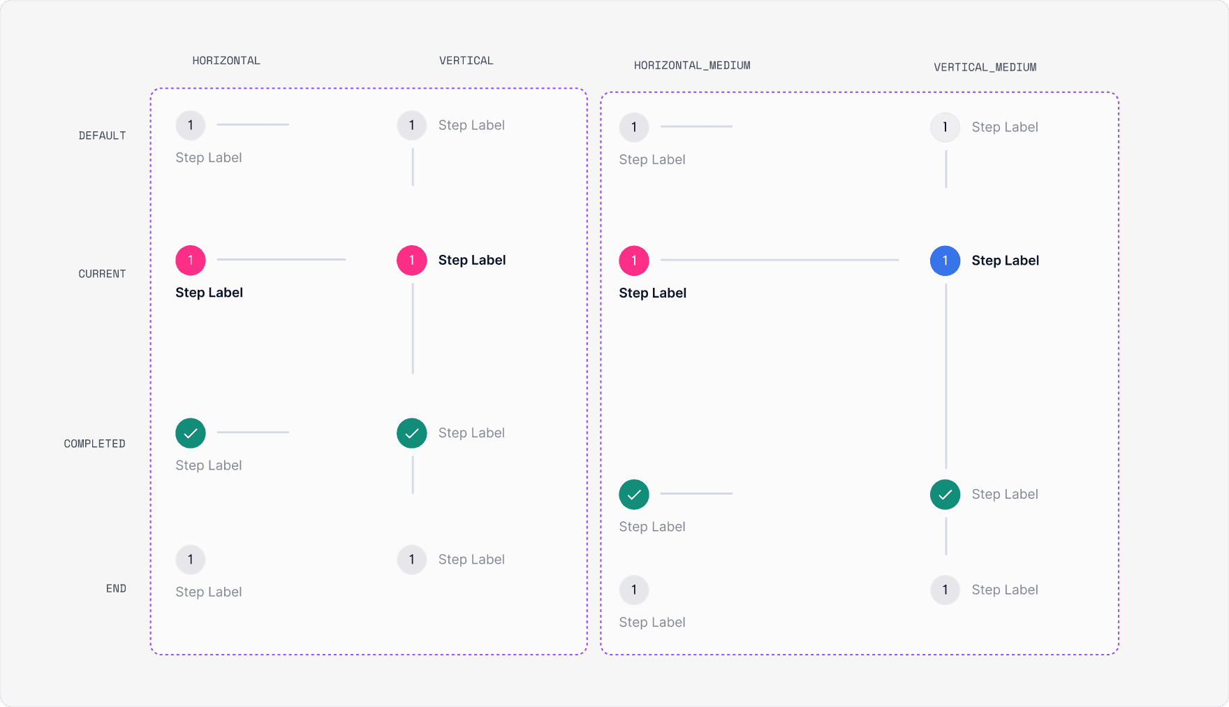
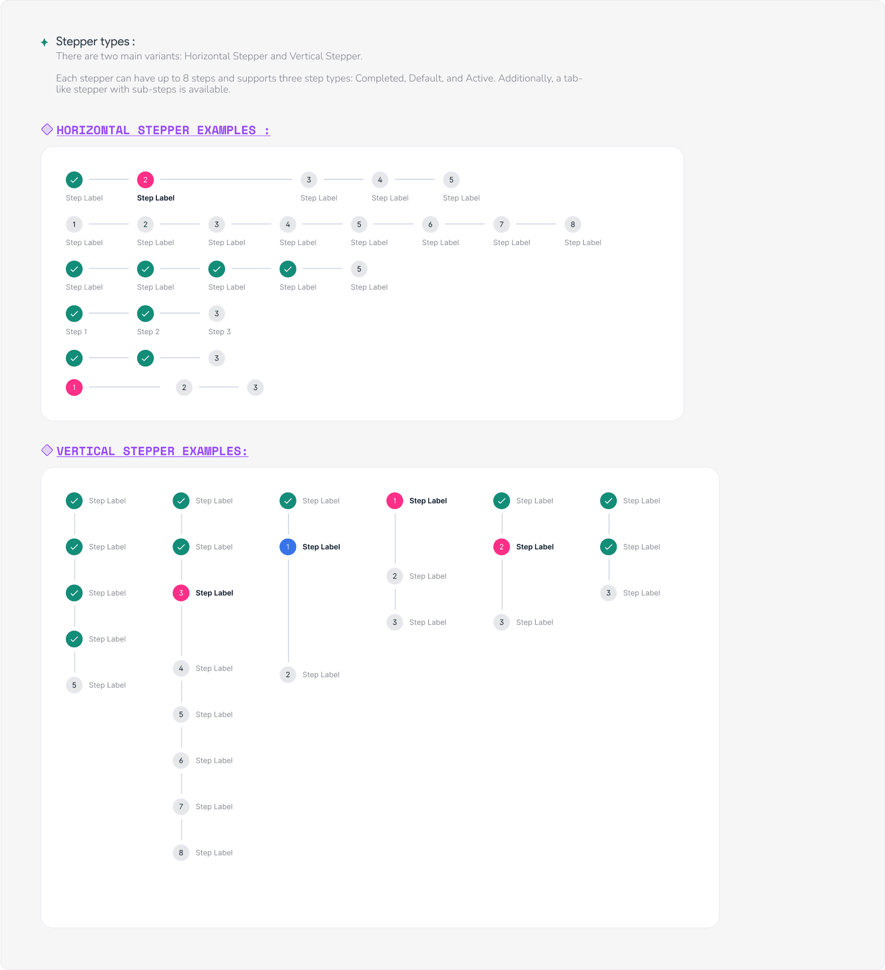
Stepper
Utilize steppers to lead users through a series of steps or actions across multiple screens, facilitating the completion of a task. Stepper tasks should consist of three or more steps.
M2.4
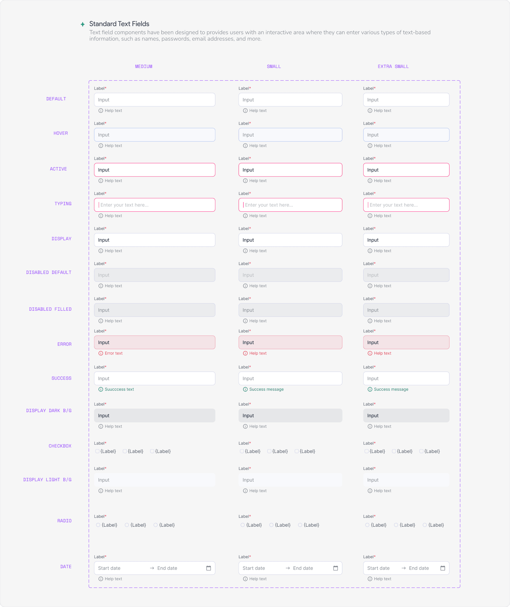
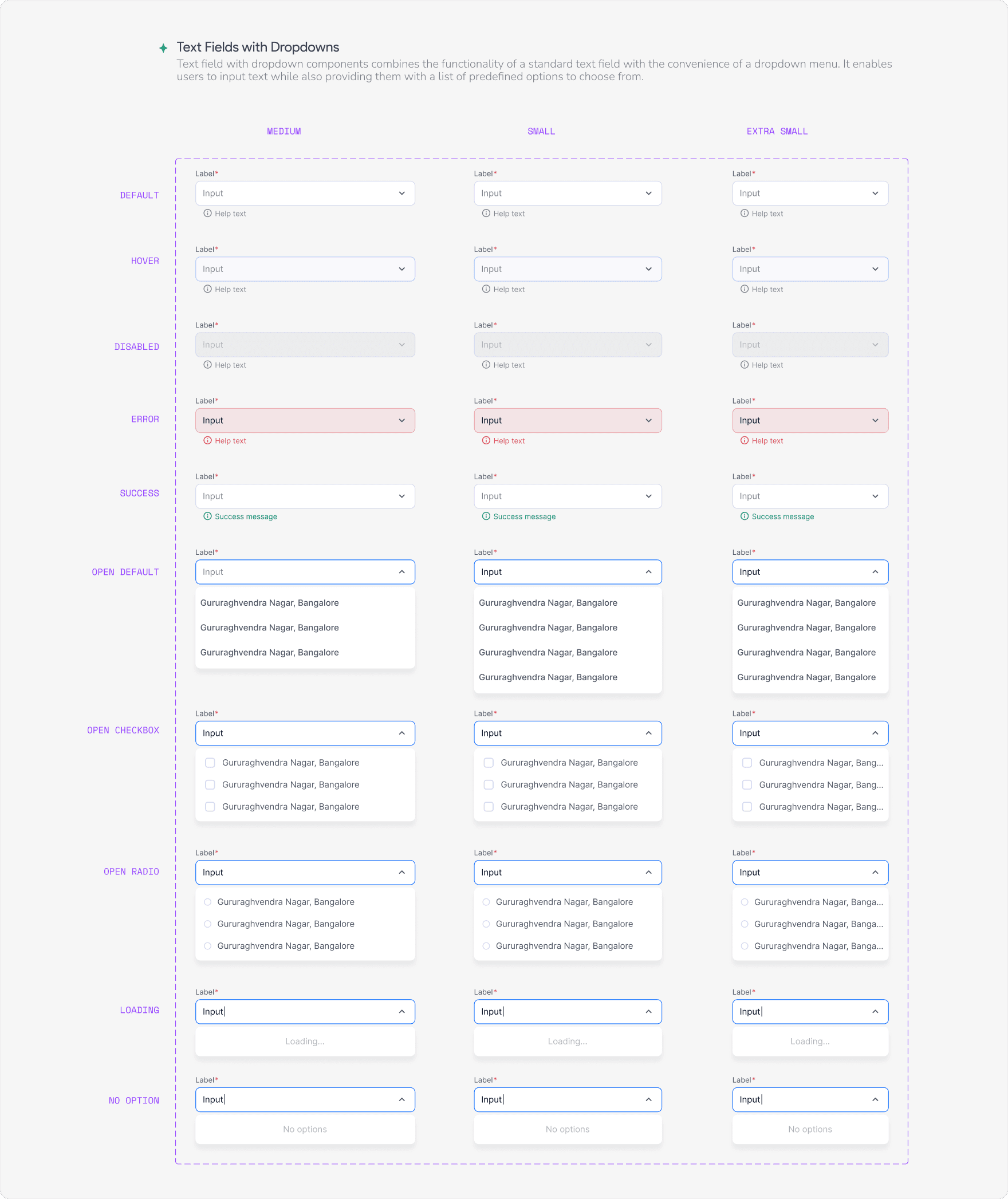
Text Fields
We have designed text fields for allowing users to provide textual input seamlessly across a wide range of applications and scenarios. Depending on the field type, users can enter plain text, passwords, numbers, or formatted content.
M2.5
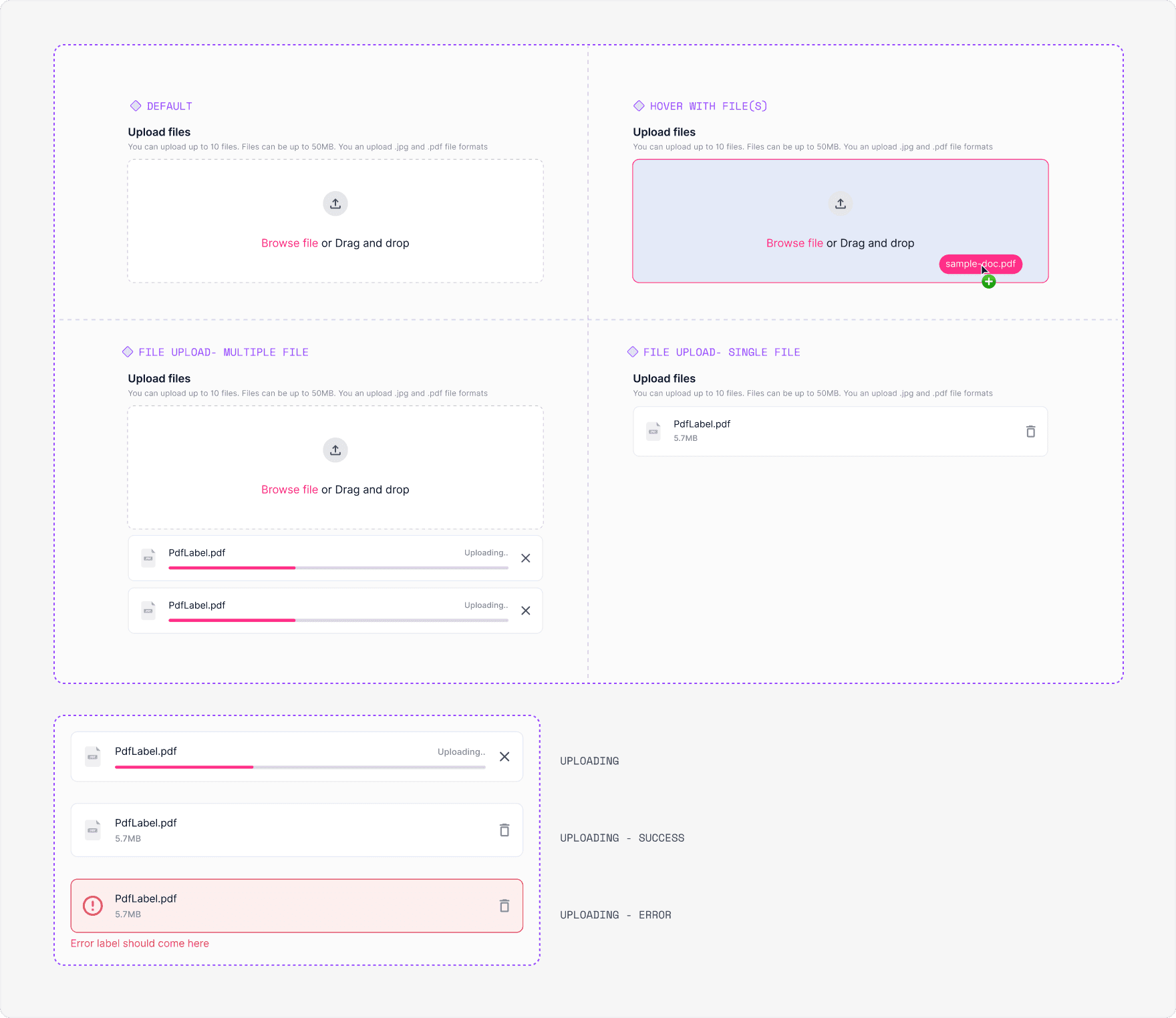
Upload modal
Our approach
Figma file
The above components are the key ones I worked on. To view all the components we worked on the phase 1, please check out this linked Figma file.
Our approach
Whats next?
The project was shelved due to high development costs, limited funding, and a short implementation cycle. We had full approval from the founder and leadership and were close to launch. Despite pausing development, we continue to use it in marketing and on our website, hoping to revive it in the future.
Other works